
Who can spot what is wrong with the map below?
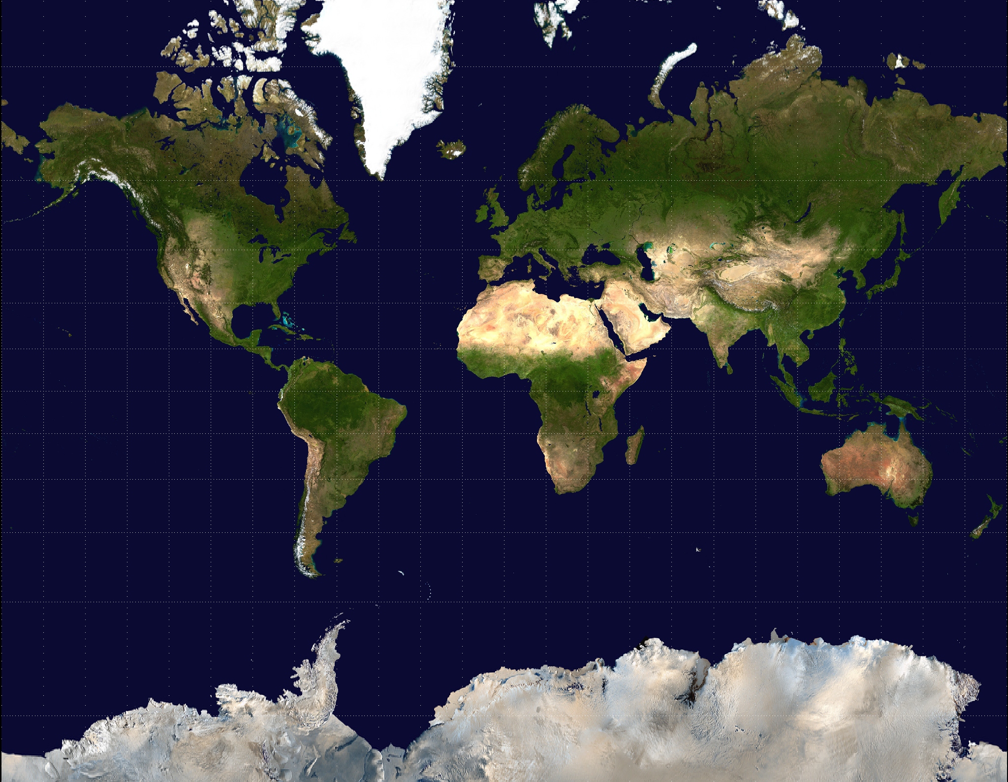
Mercator projection of Earth from NASA’s Earth Observatory “Blue Marble” series.
Would it help if I said that Greenland has an area of 2.166 million km2 and Africa has an area of 30.22 million km2? Suddenly that map isn’t looking quite so accurate.
In fact this map has been distorted so the land masses further from the equator are enlarged in comparison with those nearer to the equator. All 2D rectangular maps suffer from similar distortions to a greater or lesser extent and I’m going to talk about a few examples here.
The image above is produced using the Mercator projection which is classified as a cylindrical projection. Very generally, a cylindrical projections maps the Earth onto a cylinder and then effectively unrolls the cylinder to give the 2D rectangle. This results in the lines of equal longitude (ie those measuring the distance to the East or West) translating to parallel, vertical, equidistant lines. The lines of equal latitude (ie those measuring the distance North or South) translate to parallel, horizontal lines. However the further from the equator the greater the distance between these lines.
The Mercator projection can be mathematically described as
$x=\lambda-\lambda_0$
$y=\tanh^{-1}(\sin \phi)$
where $x$ and $y$ are the axis of the 2D map, $\lambda$ is the longitude, $\lambda_0$ is taken to be the central longitude and $\phi$ is the latitude.
The Mercator projection was first suggested by Gerardus Mercator in 1569 and has long been one of the most widely used maps. It could be because of the map’s beauty and simplicity but ultimately its staying power has been because it is conformal. For a map to be conformal, it must preserve angles and this means it is perfect for navigation.

Gall-Peters projection of a visible Earth image collected by NASA.
However the Mercator projection has seen its fair share of controversy. As the Eurasian and North American continents are further from the equator than the African and South American continents, these Northern continents appear larger than they actually are when compared to the Southern continents. In 1973, Arno Peters suggested that the Mercator projection was out of date due to this ill representation of the developing world.
It was at this time that the Gall-Peters projection rose to popularity. The Gall-Peters projection is known as a cylindrical equal-area projection which uses the transformation

Mercator map with Tissot’s indicatrices of deformation.
Stefan Kühn, CC BY-SA 3.0
$x=(\lambda-\lambda_0) \cos\phi_s$
$y=\sin\phi \sec \phi_s.$
Here $\phi_s$ is known as the standard latitude and taken as 44.138. The use of the standard latitude ensures that there is less distortion of the northern continents and so all the landmasses have areas more in line with the correct ratios than in the Mercator projection.
Both these projections have their pros and cons; there are forums dedicated to arguing over which projection is the better representation. But is there a less subjective way to compare the distortion? Tissot’s indicatrix operates by imposing perfect circles on the globe and then transforming these circles according to the projections.

Gall-Peters projection with Tissot’s indicatrices.
Eric Gaba, CC BY-SA 4.0
Now this blog post could go on for a while if needed. There are over 50 different map projections that have been used for one purpose or another. None of them are perfect, but there are some which get it more correct than others. One such one is the Winkel Tripel projection which is currently used as the standard projection by the National Geographic Society.
The Winkel Tripel projection is known as a modified azimuthal projection. An azimuthal projection is one that preserves all directions relative to a given reference point. The Winkel Tripel projection can be described mathematically as
$ x = \frac{1}{2} \left[ (\lambda-\lambda_0) \cos \phi_1+\frac{2 \cos \phi \sin \frac{\lambda-\lambda_0}{2}}{\operatorname{sinc} \alpha} \right] $

Winkel Tripel projection of a Visible Earth image created by NASA.
$y=\frac{1}{2}[\phi+\frac{\sin \phi}{\operatorname{sinc} \alpha}]$
where
$\alpha=\arccos[\cos \phi \cos \frac{\lambda-\lambda_0}{2}]$
and
$\phi_1=\arccos \frac{2}{\pi}.$
It should be noted that the Winkel Tripel is neither conformal nor area preserving. Instead it compromises between both and seen as a more successful representation of the Earth for this compromise.

Winkel Tripel projection with Tissot’s Indicatrices.
Eric Gaba, CC BY-SA 4.0
Truthfully I don’t remember the last time I looked at an atlas before writing this article. After all, in an age of satellite images and Google maps, are atlases truly required? I don’t know, but what is clear is that the maps we grew up looking at are far from the full story.
More from Chalkdust

Mathematics and pregnancy
Eleanor Doman and Qi Zhou swap percentages for placenta-ges
In conversation with Trachette Jackson
We chat with Trachette about her work in mathematical oncology, her role models, and boosting diversity in mathematics
Page 3 model: Cooking spaghetti
Some saucy modelling
Page 3 model: Bees
You won't bee-lieve it
Black mathematician month 2019
A month celebrating the contributions of black mathematicians
Page 3 model: Game of Thrones
Using graph theory to predict who will sit the iron throne